04 / 06 · Simjo
Simjo - A construction PM tool, rebuilt around the three pillars that matter on site.
The Dutch construction sector runs on tools built in the early 2000s. They work. They're stable. They also can't connect the three things every project manager actually juggles in their head: scope, time and money. When one changes, the others should respond. In legacy tools, they don't.
Simjo's founders had decades in the industry. They knew the shape of the gap. A first concept was built outside, with a different team. After a year of using it themselves, the verdict was unanimous: the technical foundation didn't hold, and the UX was a chaos. They decided to redesign and rebuild.
A first designer was brought in to make the initial direction. When she moved on, I picked up where she left off - with a clear remit: bring it home. Build out the design system on Material 3, finish every screen of the app, and design the new marketing site to match.
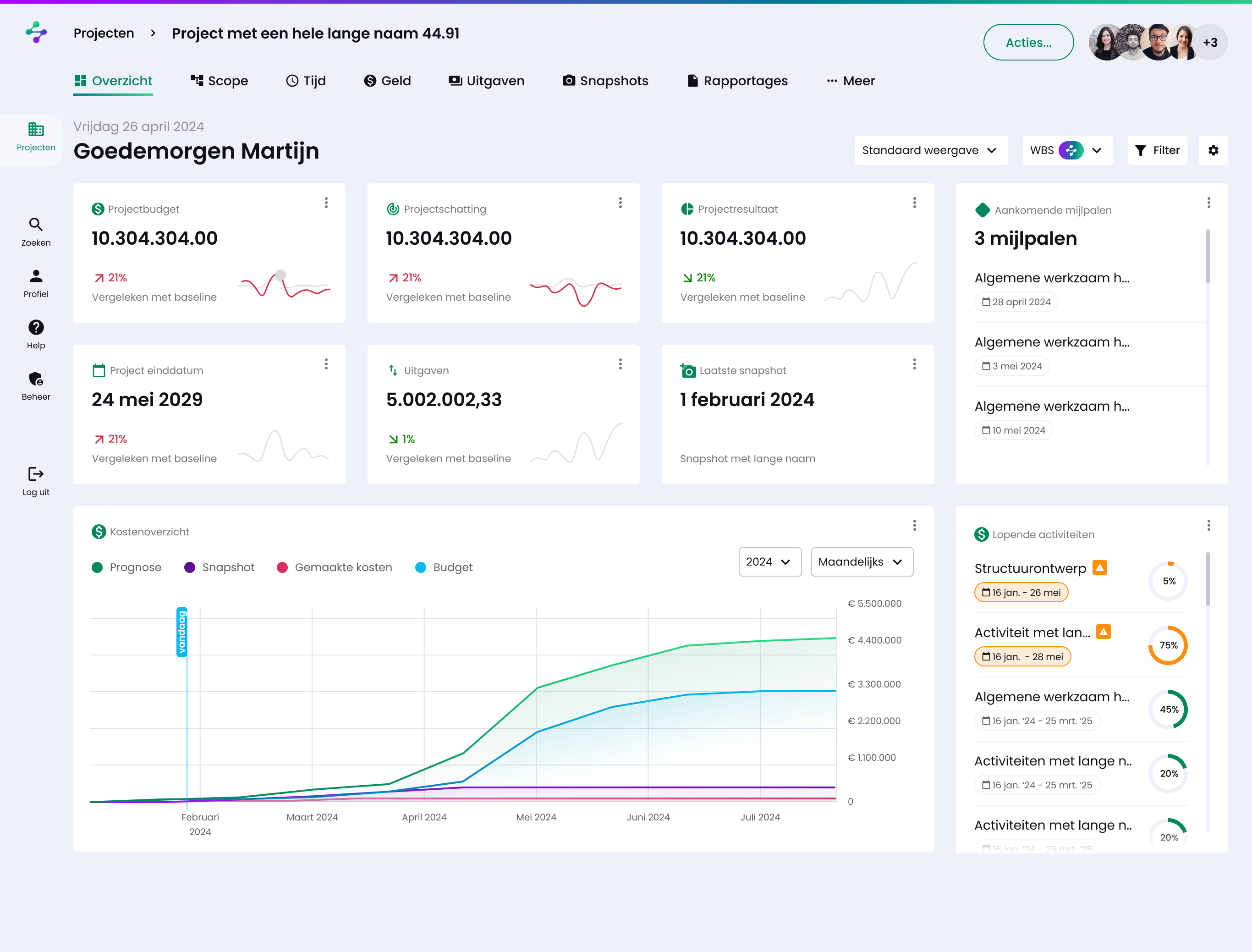
Everything in Simjo - every screen, every table, every report - hangs off three concepts. The product's job is to keep them in sync, so a change in one is visible in the other two before it becomes a problem on site.
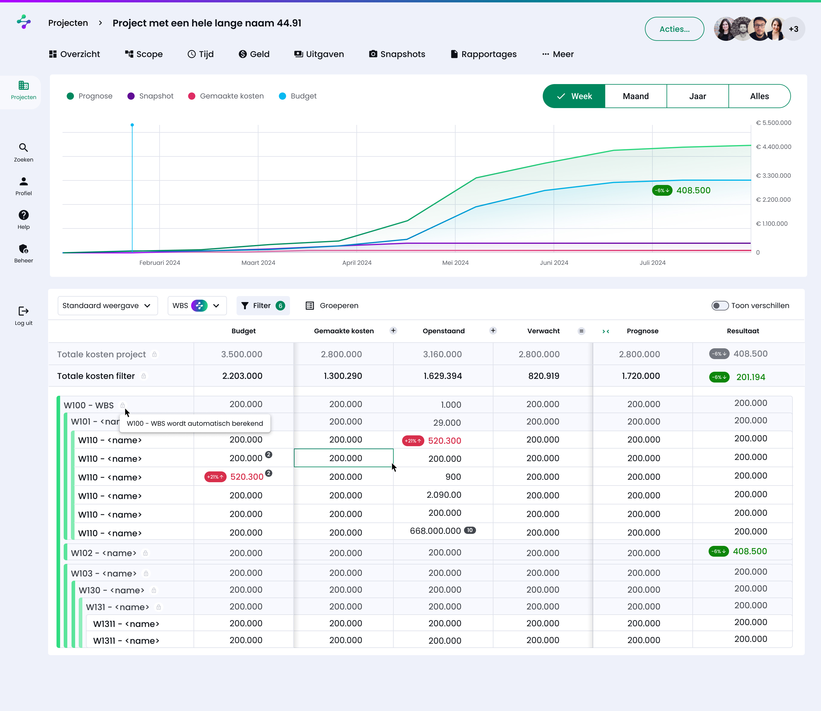
Work breakdown, structures, deliverables. The WBS table is the spine of the app - every other view rolls up from here.
Schedules, durations, dependencies. Gantt views, milestones, baselines. Time is shown both as plan and as actual, always.
Money flows - in and out. Budgets, expenditure, geldstromen overview. Tied to scope items so cost lives where the work lives.
Six months is a tight window for a full app + design system + website. I split it into four runs and committed to one happy path per pillar before exploring edges.
Picked up the existing direction and built out tokens, components, typography. Standardised on Material 3 patterns.
Sitemap with pages, actions and wizards. Eight project sections - Overzicht, Scope, Tijd, Uitgaven, Geld, Snapshots, Rapportages, Meer.
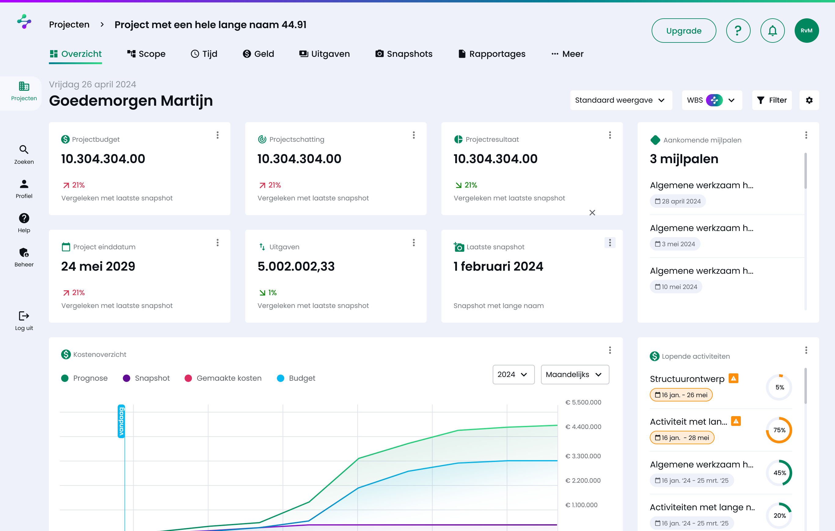
Dashboard, WBS structures, Gantt views, geldstromen. Empty states, side panels, right-click context menus.
New site to match the app. Same design system, same brand. Hand-off package for the build team.
Every part of the app is a page, an action or a wizard. Three primitives, used consistently, kept the IA legible at any zoom level.
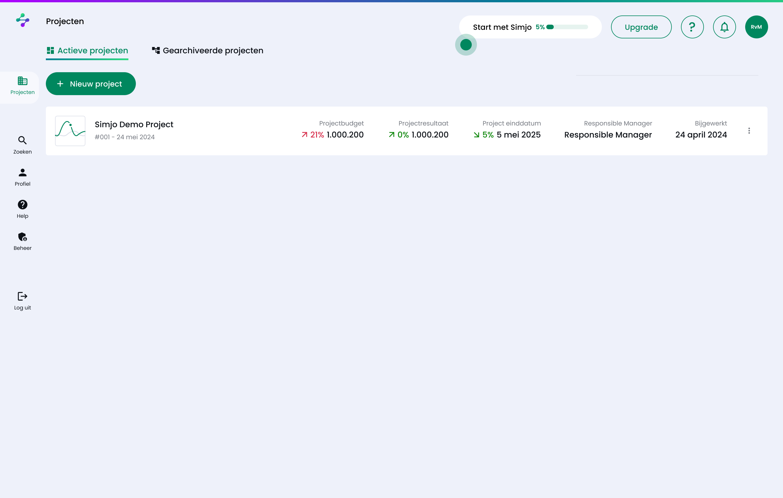
A walkthrough of the core surfaces - Projecten overview, Project dashboard (Overzicht), the WBS Scope view, Tijd as a Gantt, and Geld as a connected cost overview. Real exports from the working application.
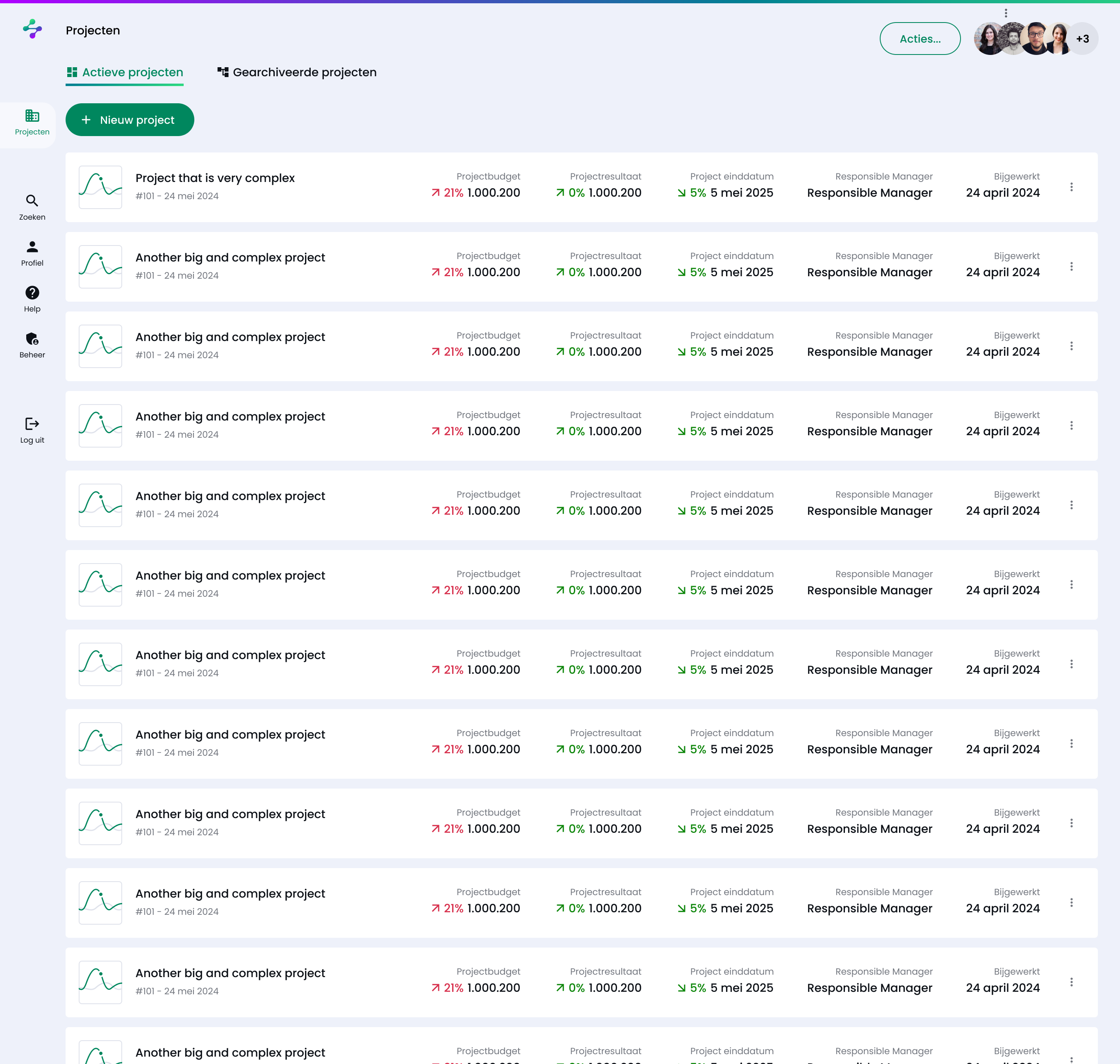
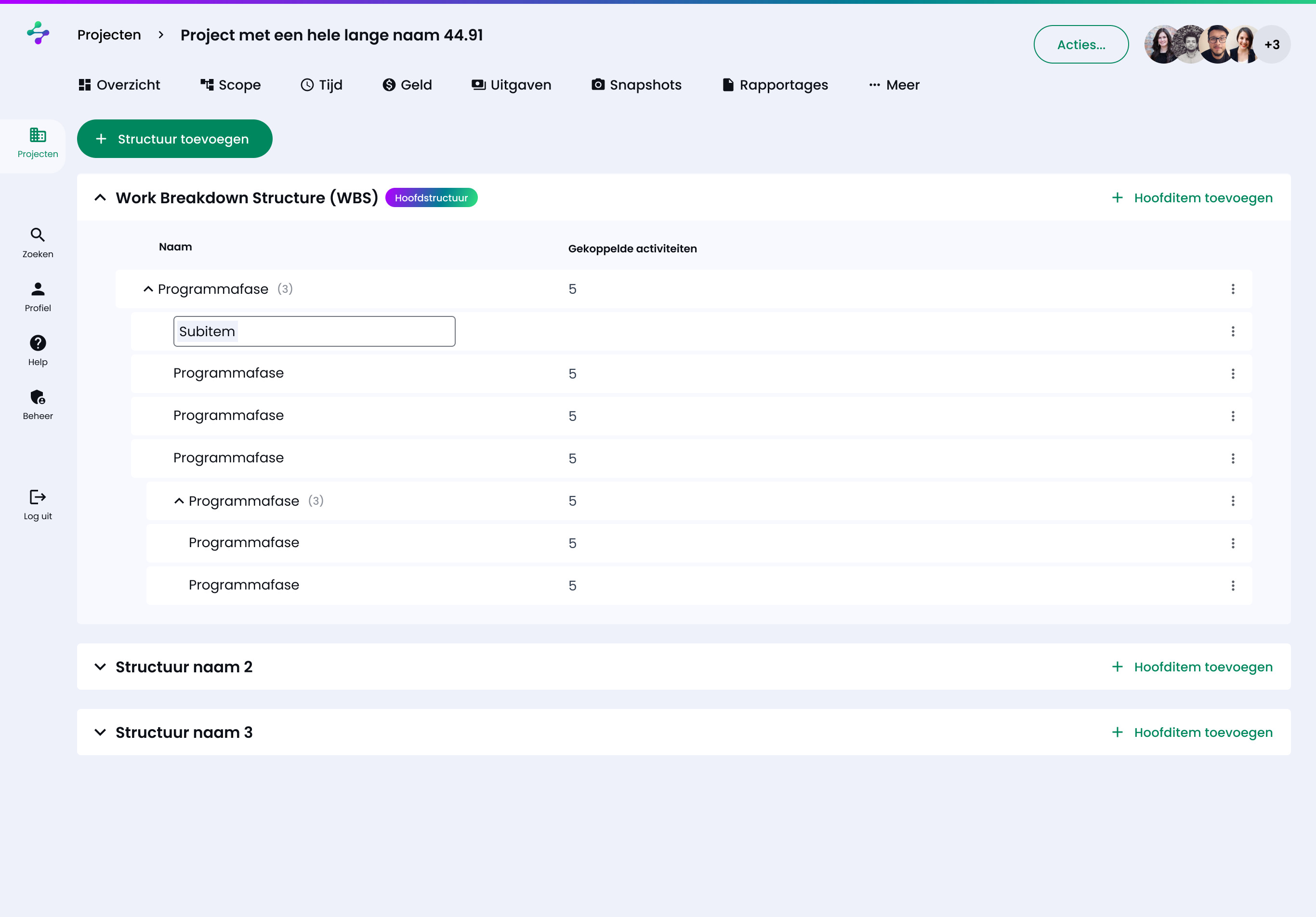
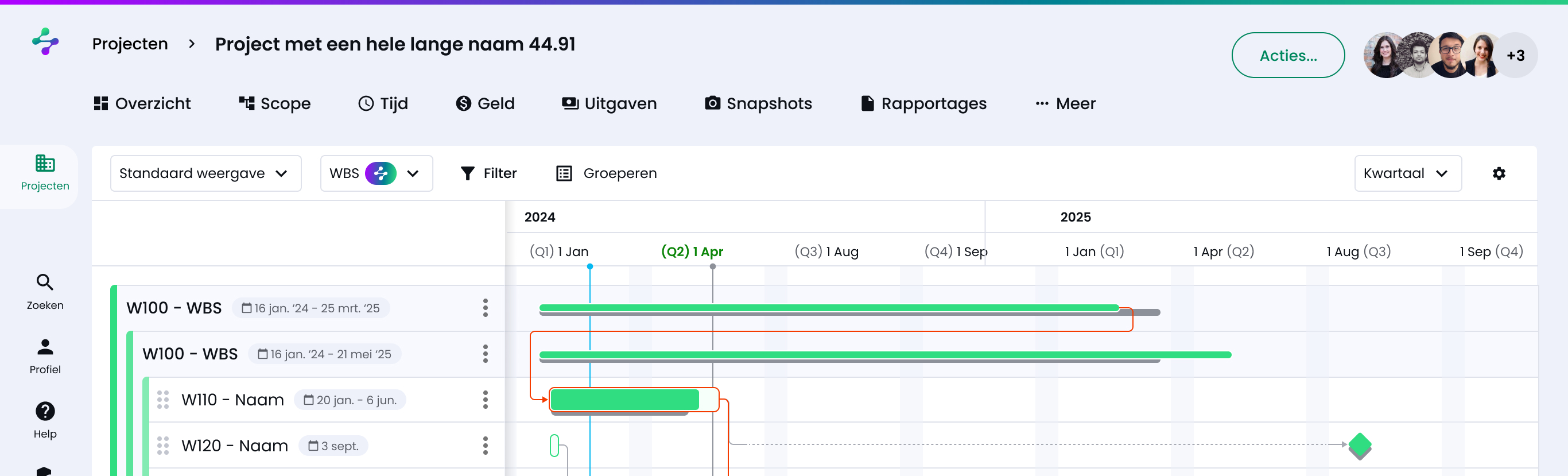
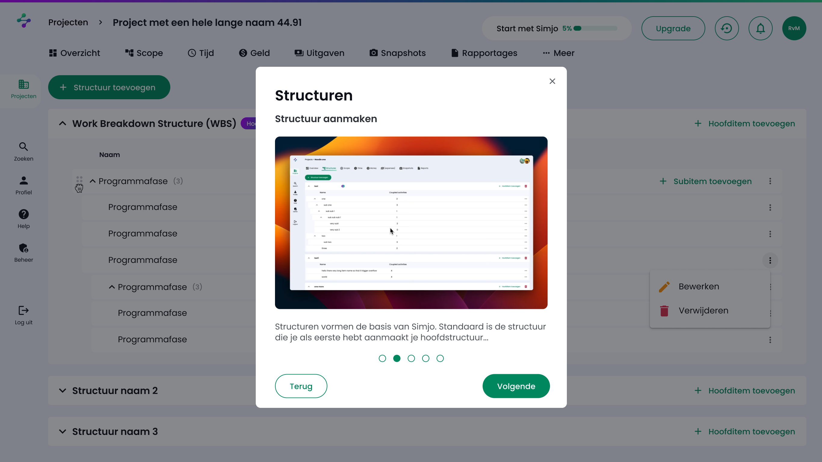
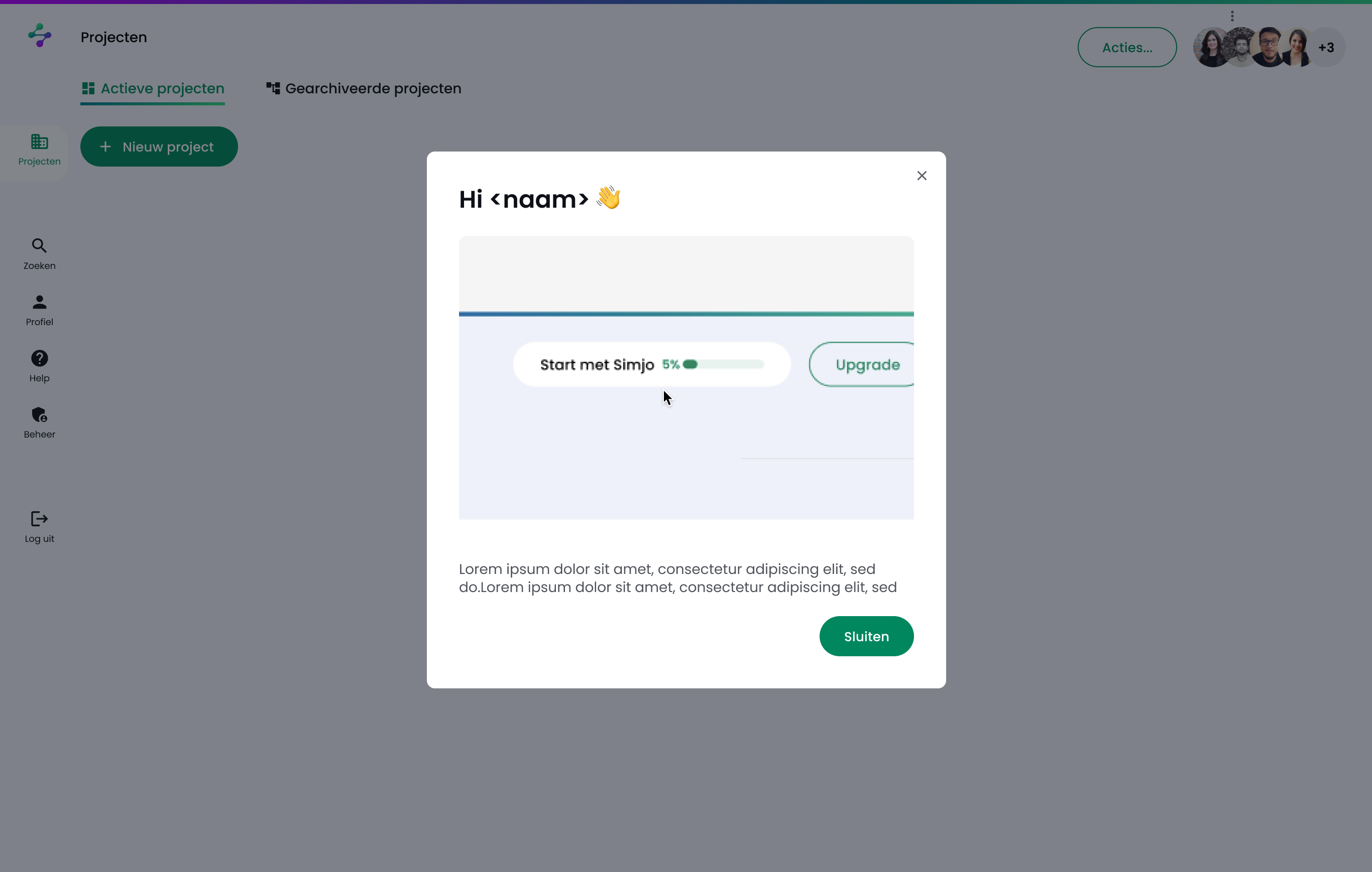
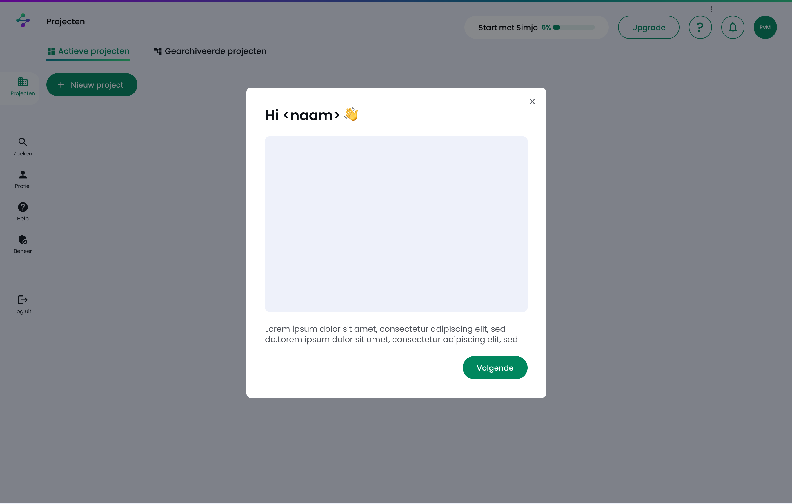
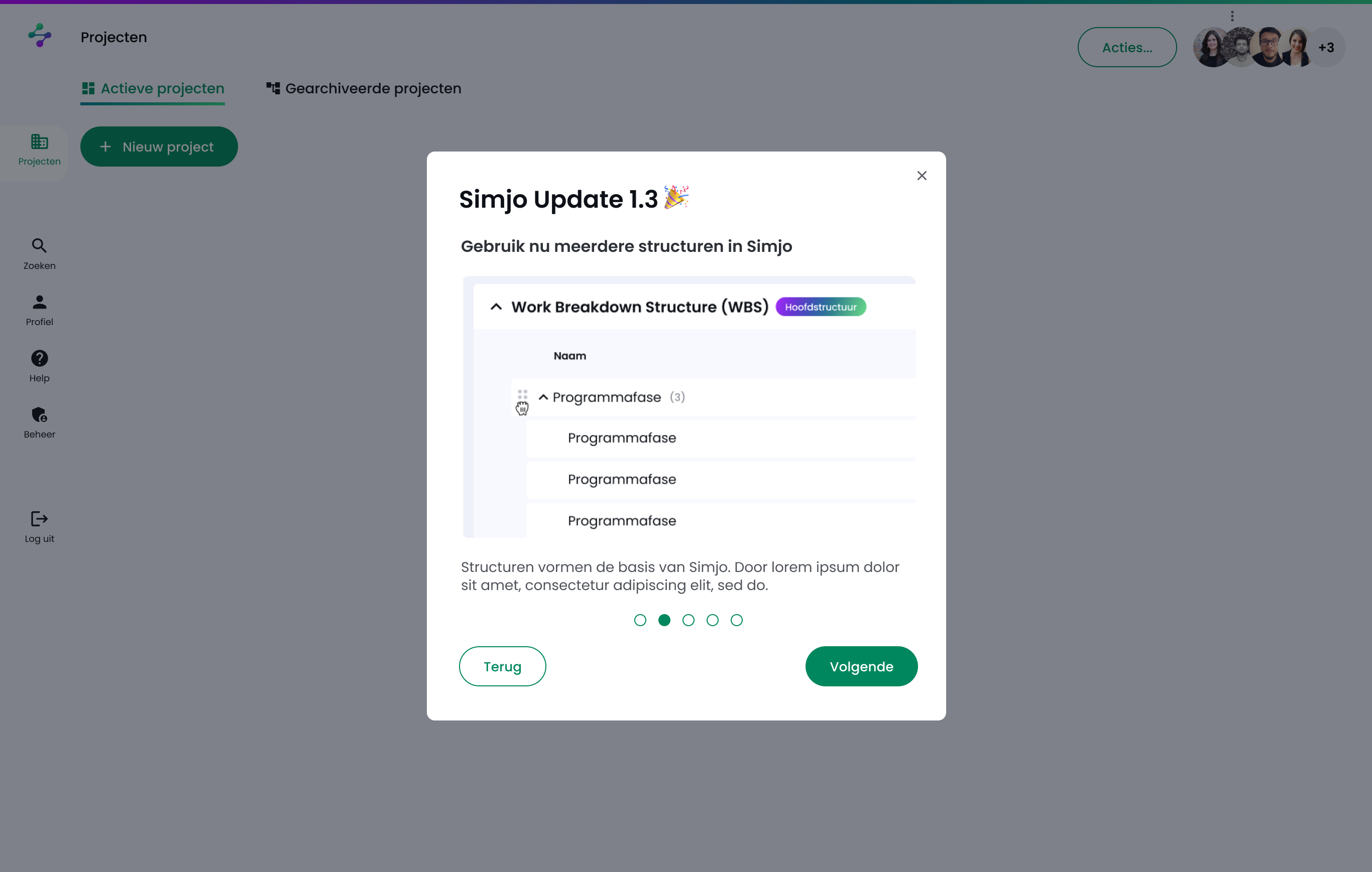
Construction PMs are not signing up at 11pm and exploring the product alone. But the same PLG fundamentals still apply - qualify, demo, activate, retain. Click through the actual flow below.
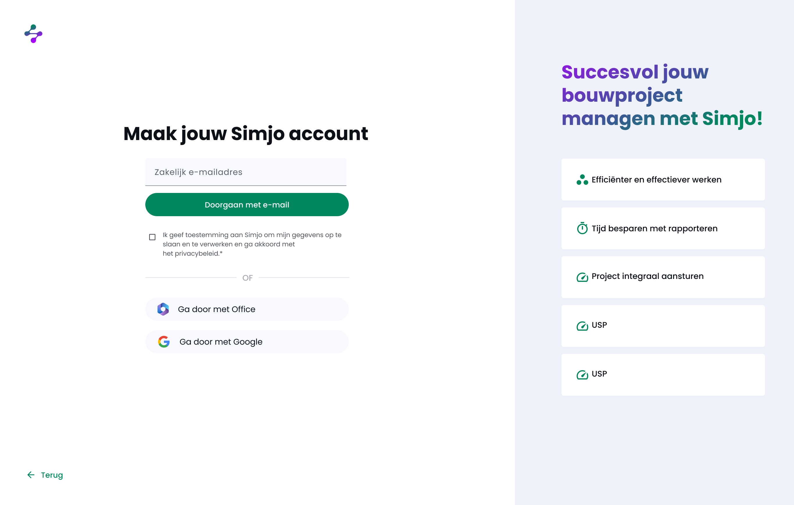
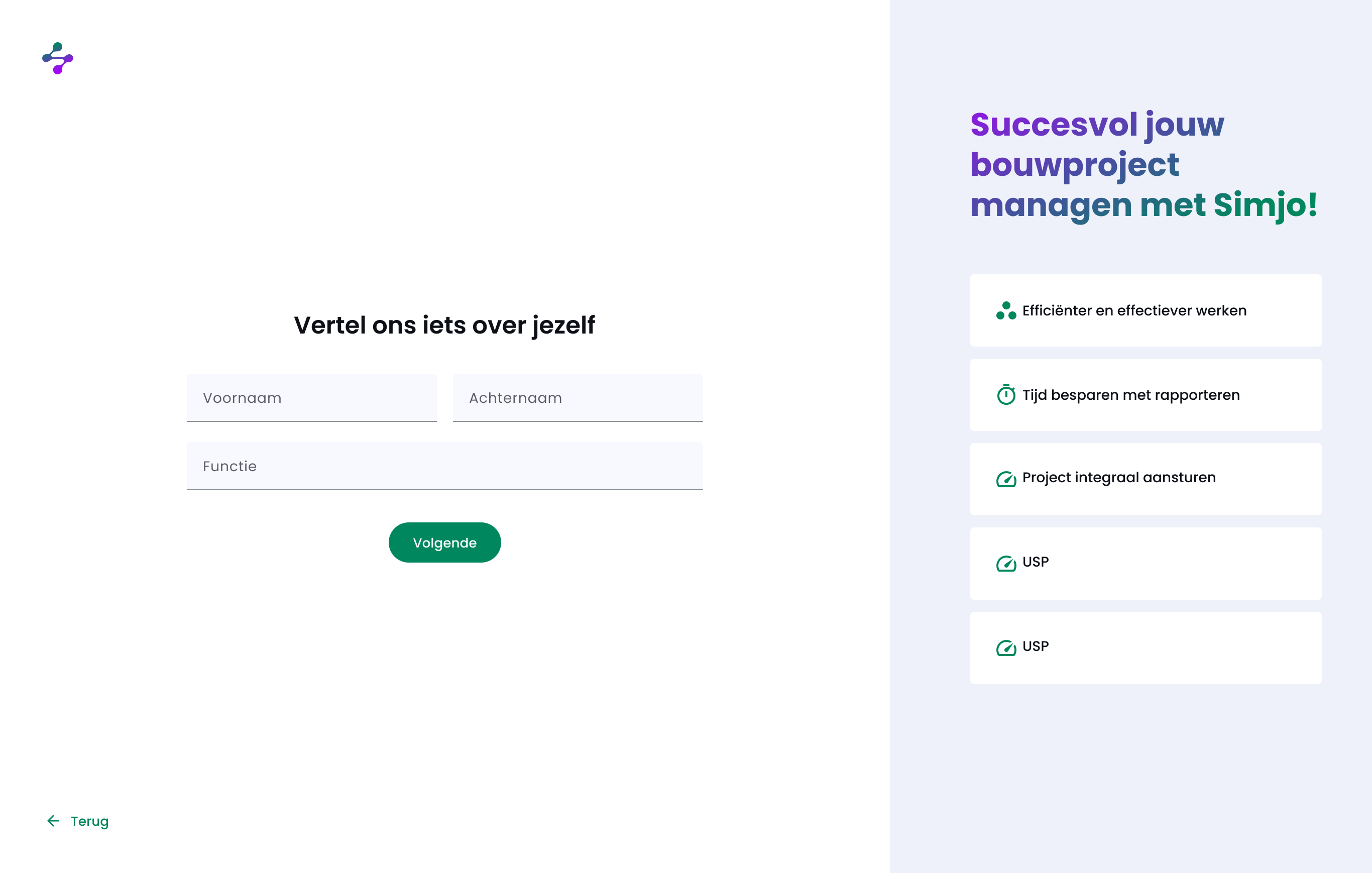
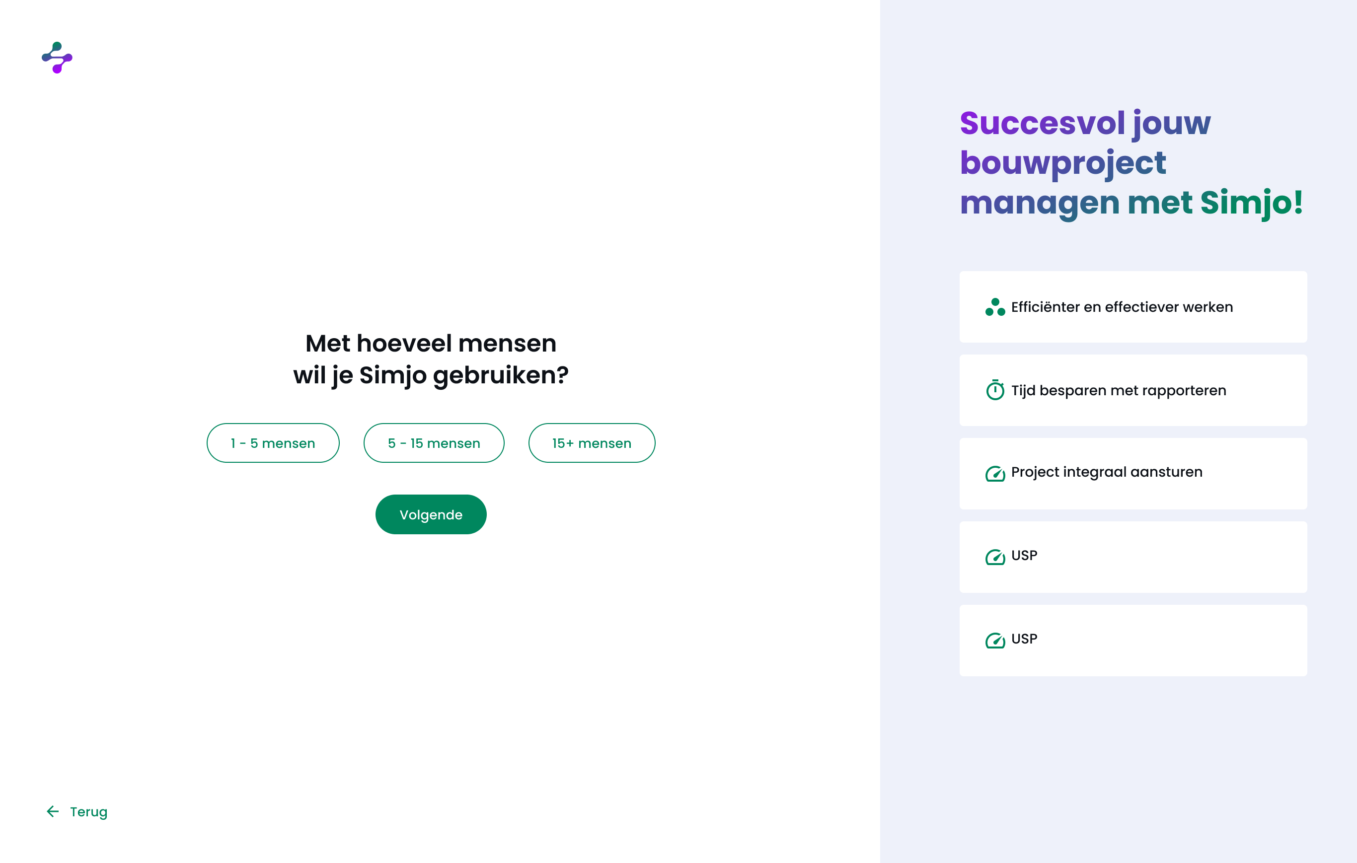
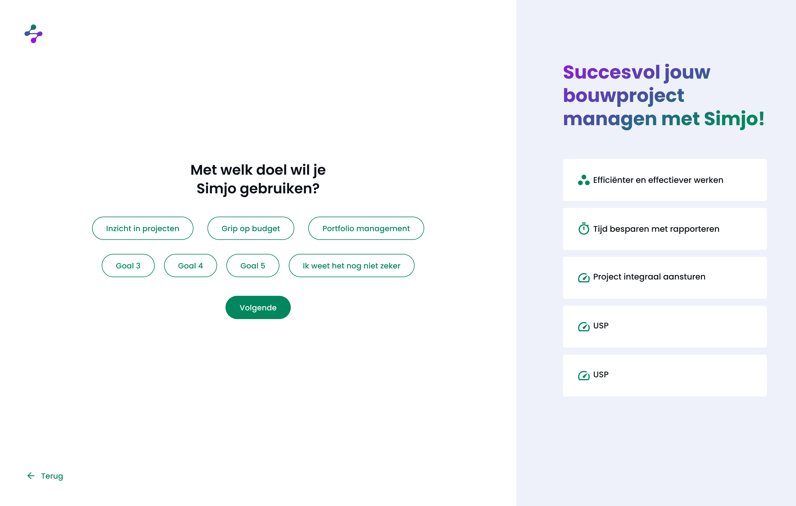
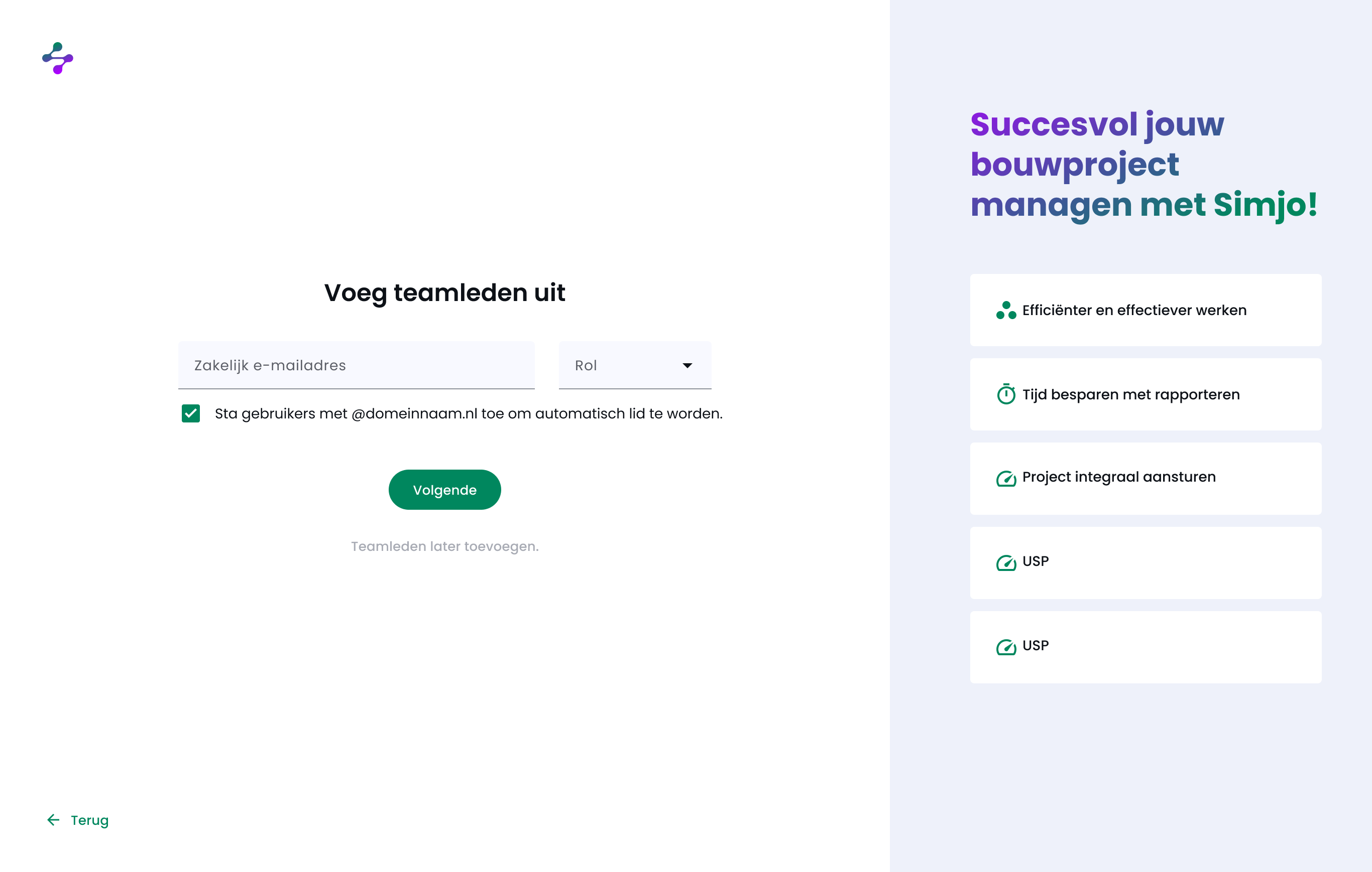
 Click to advance →
Construction PMs run the gamut from "first day on the tool" to "I've been doing this for thirty years." The interface had to read clearly for both.
Every section starts with an empty-state that tells the user what this view is for and what the first action should be.
Every WBS row, every activity exposes a context menu with the most-used actions and keyboard shortcuts.
Click any row to slide a detail panel in from the right - context, dates, money, files. Stays open while you work the table.
New project, new WBS, new baseline - the moves that have ten fields and three decisions sit behind a four-step wizard.
Shift-click to select a range. Action bar appears at the bottom with bulk operations: move, reassign, set dates, delete.
Three view modes per table: comfortable, default, compact. Same data, different breathing room.
The previous designer had set Material 3 as the foundation. I extended it: tokens, components, naming, variants.
Six months. Start with a design system already in motion. End with a complete app design, a hand-off package and a marketing site that matches. Simjo went into build the moment I stepped off, and the team kept moving without losing pace.
What I'm proud of: that the three pillars - scope, tijd, geld - actually feel connected in the app. A change in scope shows up in tijd. A change in tijd shows up in geld. The product reads like one product, not three modules sharing a logo.
What I'd do differently: invest one more week in the empty states, up front. The first-time user experience is where a SaaS lives or dies, and we kept polishing those right up to the deadline.