03 / 06 · Matterhorn
Matterhorn - Regulatory reporting, retooled around the people doing the work.
Matterhorn is a SaaS platform used by regulatory reporting teams in asset management - the people who file AIFMD reports, NAV updates and other regulator-bound documents for fund clients. Steady customer base, sticky product, no real fires.
What the team didn't have: a smooth path from data arrives to report submitted. The product worked, but the day was spent emailing clients for missing files, manually copying numbers between sheets, and chasing approvals across teams.
I came in as lead UX designer, freelance. The brief: figure out what "effortless reporting" actually means inside Matterhorn - and draw every screen of it. Halfway through, the company was acquired by FE fundinfo. The new parent brought a fresh design system. I rebuilt the screens on it. Same flow underneath, different visual surface.
How do users actually work with - and experience - Matterhorn's software? A mix of long-tenure power users and brand-new clients, surveyed and interviewed in parallel so I could spot where the two groups diverged.
The zero on full-service was itself a finding - those users have less of a relationship with the interface. They submit, they leave.
Live walkthroughs of a real report being prepared. I watched fingers, not just clicks - where they hesitated, where they alt-tabbed to Excel.
Composite persona from the power-user segment. The shape is real - every detail tracks to something a real user said.
Senior Associate · Regulatory Reporting · mid-sized consultancy
Role. Senior Associate Regulatory Reporting at a mid-sized consultancy. Responsible for AIFMD reports across multiple fund clients.
Education. BA in Economics & Mathematics.
Experience. 4 years in finance and reporting. Daily Matterhorn user.
Tech. Proficient in Excel, Tableau, other analytics tools. Comfortable adopting new software if it's intuitive.
Insights from surveys + interviews, clustered. Each one is a real pattern, not a hypothesis. Together they made the design brief almost write itself.
Every client uses a slightly different rhythm. Reporters end up tracking who-said-what in their own inboxes. Nothing centralises.
"Where's the file?" by email. By Teams. By phone. Then again next week. This is most of the calendar.
Even users who've been on the product for years asked for documentation. The product isn't shallow - but the path through it isn't visible.
Internal reporters don't really use the dashboards. Clients do. The product is dressed for the wrong audience by default.
Two completely different jobs sharing the same screen. Status (mine) and visualisation (theirs) need different surfaces.
Risk department signs off last. They're never on the same cadence as reporting. The whole flow waits.
Templates and error handling are where new users hit the wall. The first five minutes are fine; minute six is not.
Power users have years of personal Excel logic. Any move to the cloud has to preserve that customisation, not replace it.
"How far am I, this quarter?" There's no answer in-product. Reporters keep their own counters.
Client submissions come in at scale. The product handles them one by one. Reporters batch via the filesystem instead.
Errors say what went wrong but not what to do. New users hit the same walls repeatedly without an obvious next step.
Reporters want to check sections as data arrives, not wait for the whole report. The PDF viewer is the bottleneck.
Each one traces back to specific insights above. We worked the top three first - together they cut a reporter's day by an estimated 40%.
NAV updates, quarterly references, repeat data - propagate automatically. Stop re-typing.
Centralise client comms. Standardise the request, the chase, the receipt. End the inbox sprawl.
The product chases, not the human. Reporters get a quiet day; clients get a polite nudge.
Every error gets a what-to-do alongside the what-went-wrong. Especially the first ten errors a new user hits.
Internal reporters see status and queues. Clients see visualisations. Same data, different surface.
Annotations, pinpointed comments on sections, robust navigation. The viewer is where the actual review happens.
Drag a folder. Done. Plus better shared-drive organisation and clear file states.
Approve what's ready as it becomes ready. Stop waiting for the whole report to finalise sub-sections.
Migrate fully cloud-based, but preserve the flexibility power users built into their Excel templates over the years.
The plan was four phases over ten months. The acquisition arrived in month six. Phase 4 turned into a brand migration on top of a flow redesign.
3 surveys, 5 interviews, persona work, journey mapping. Output: the insights + recommendations above, signed off with the product team.
Drew one end-to-end reporter day. Cut, re-tested with the same users, cut again. Stayed on the existing brand - first job was to prove the flow.
Mid-fi prototypes back to Carne and the Reporting Service users. Their notes on flow #1 reshaped flow #2 in two cycles.
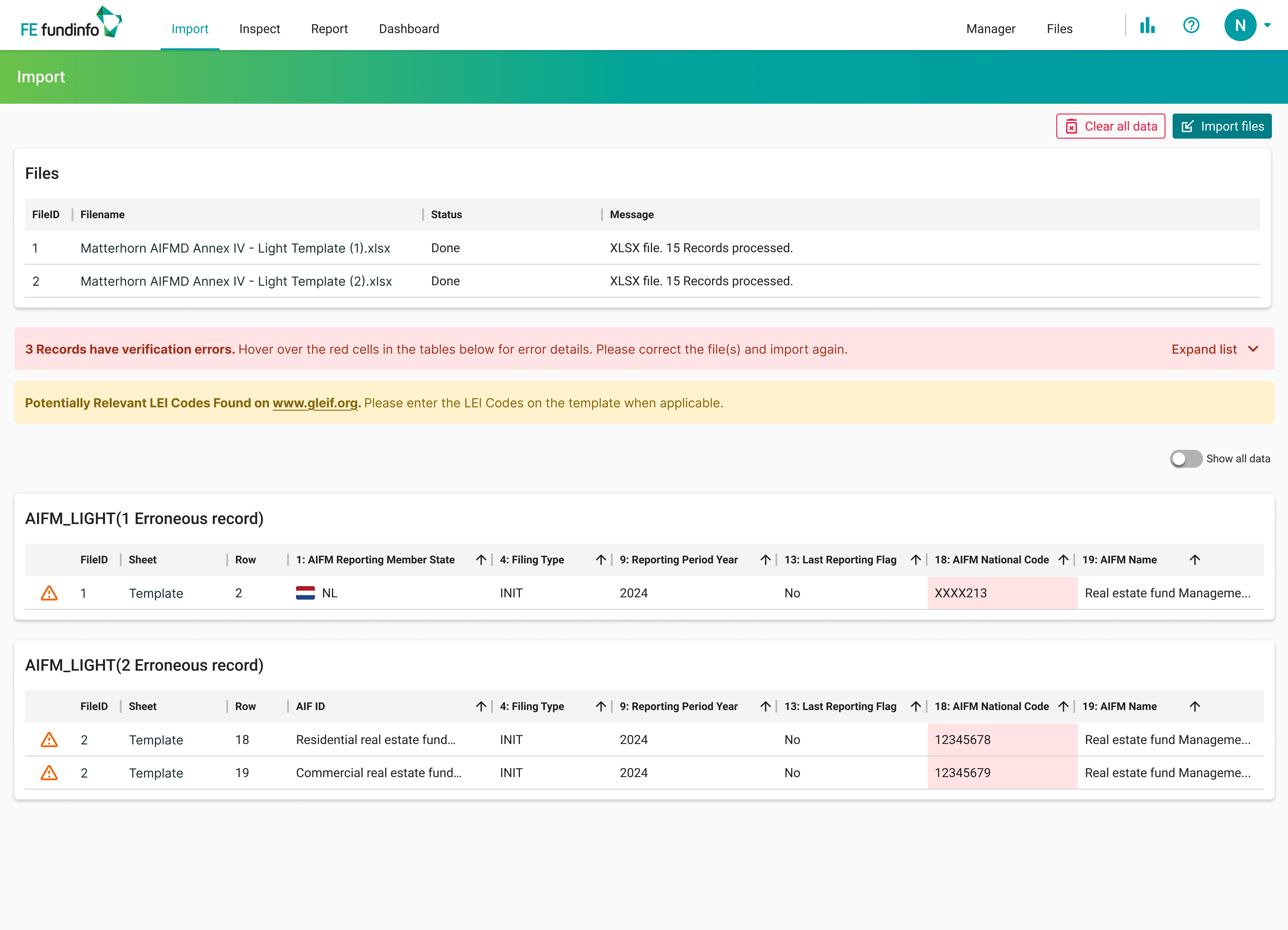
Acquisition. New tokens (teal, dark blue), new components. Every screen rebuilt on the FE design system. Flow underneath: unchanged.
A walkthrough of the core surfaces - Dashboard, Import, Inspect, Report - plus the detail overlays. Real exports from the live application, rebuilt on the FE brand tokens after the acquisition.
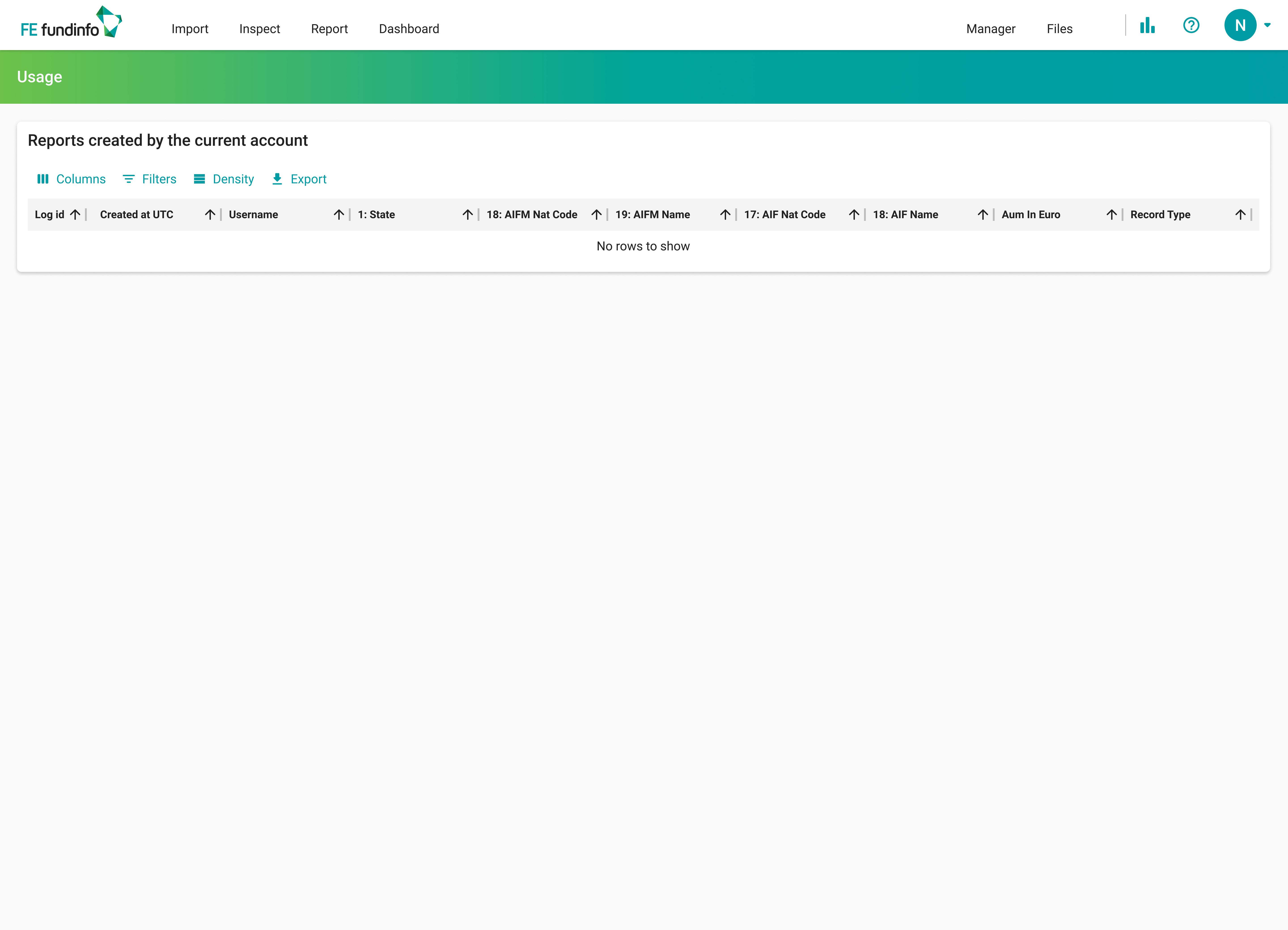
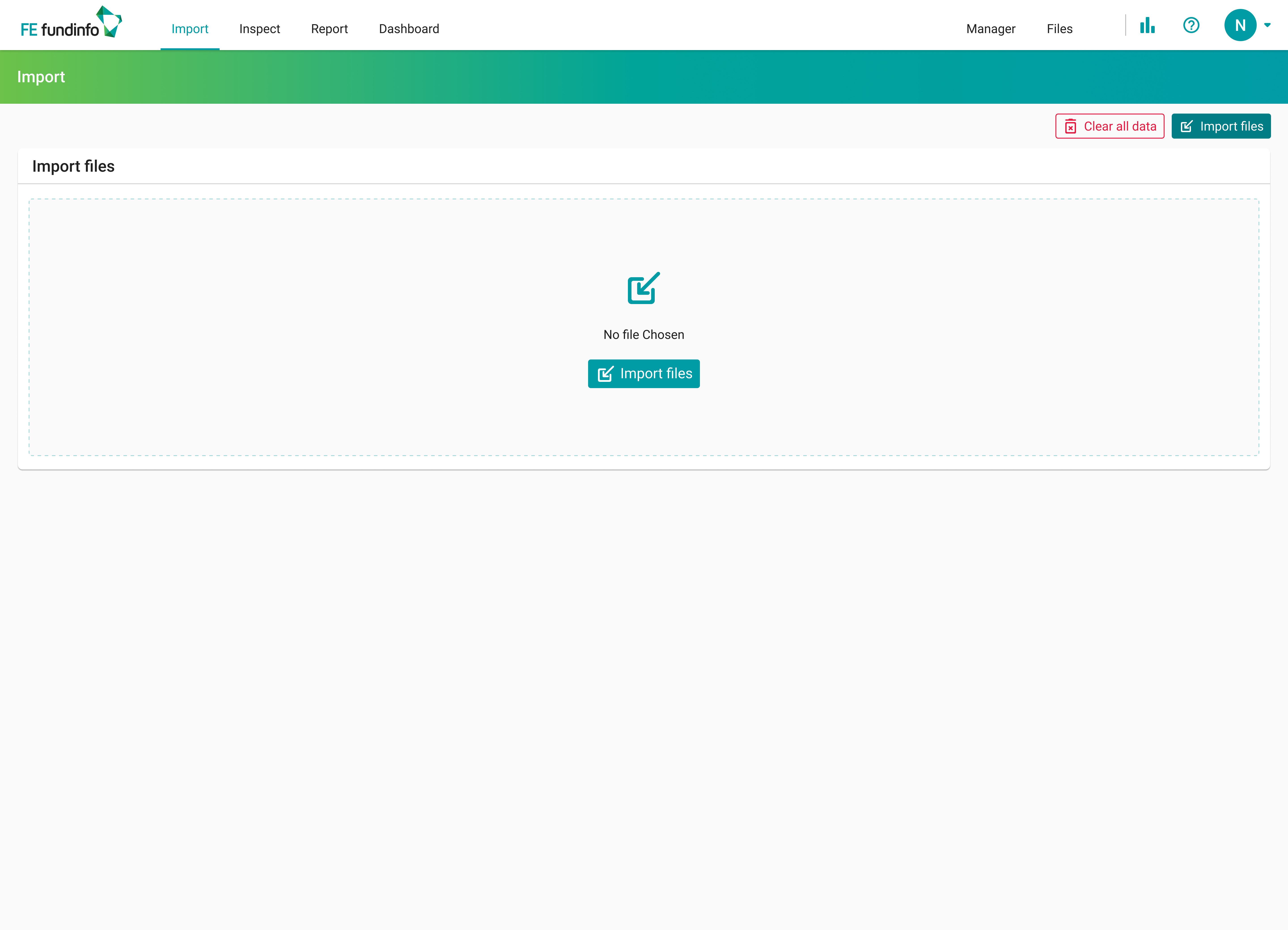
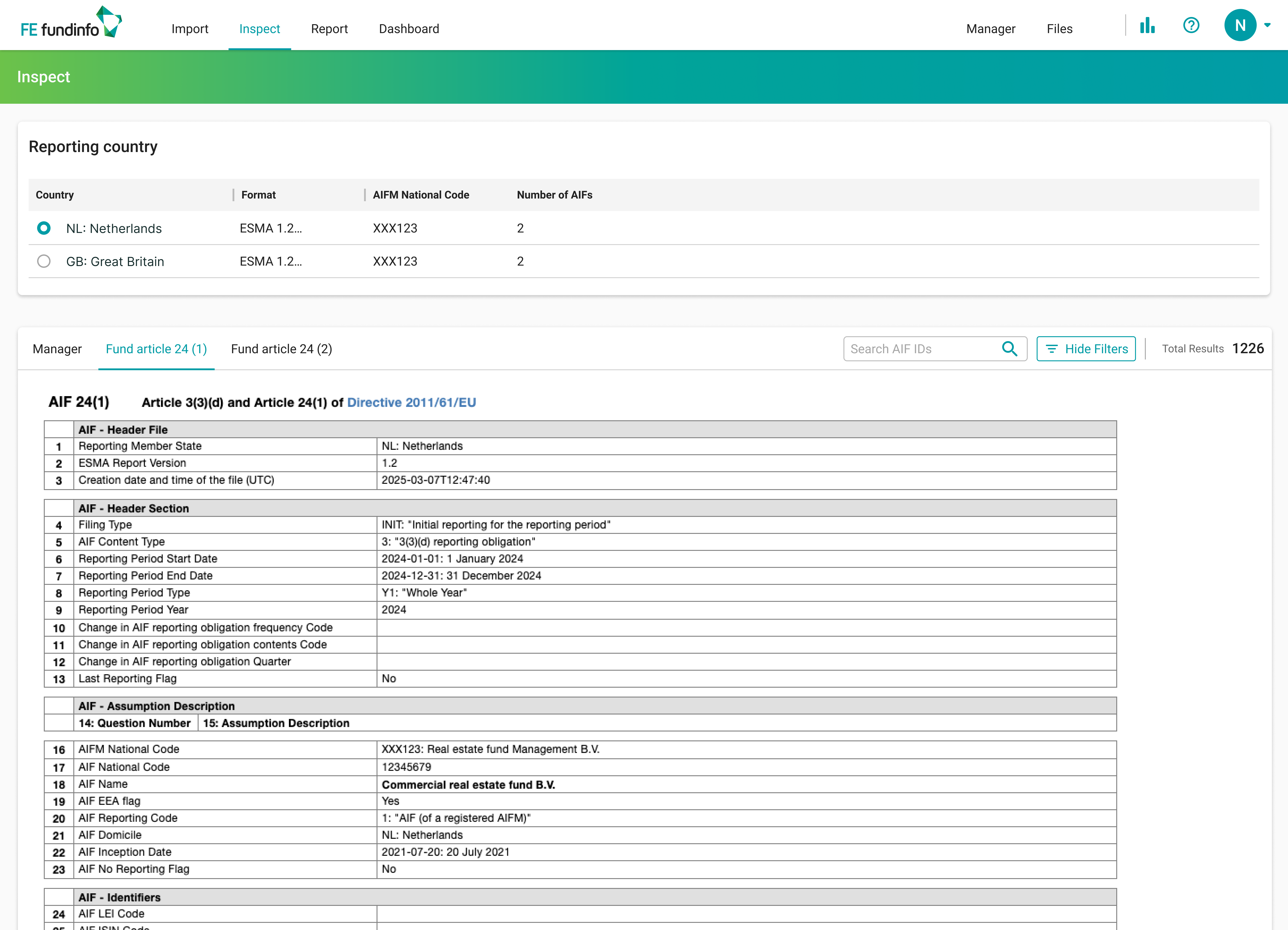
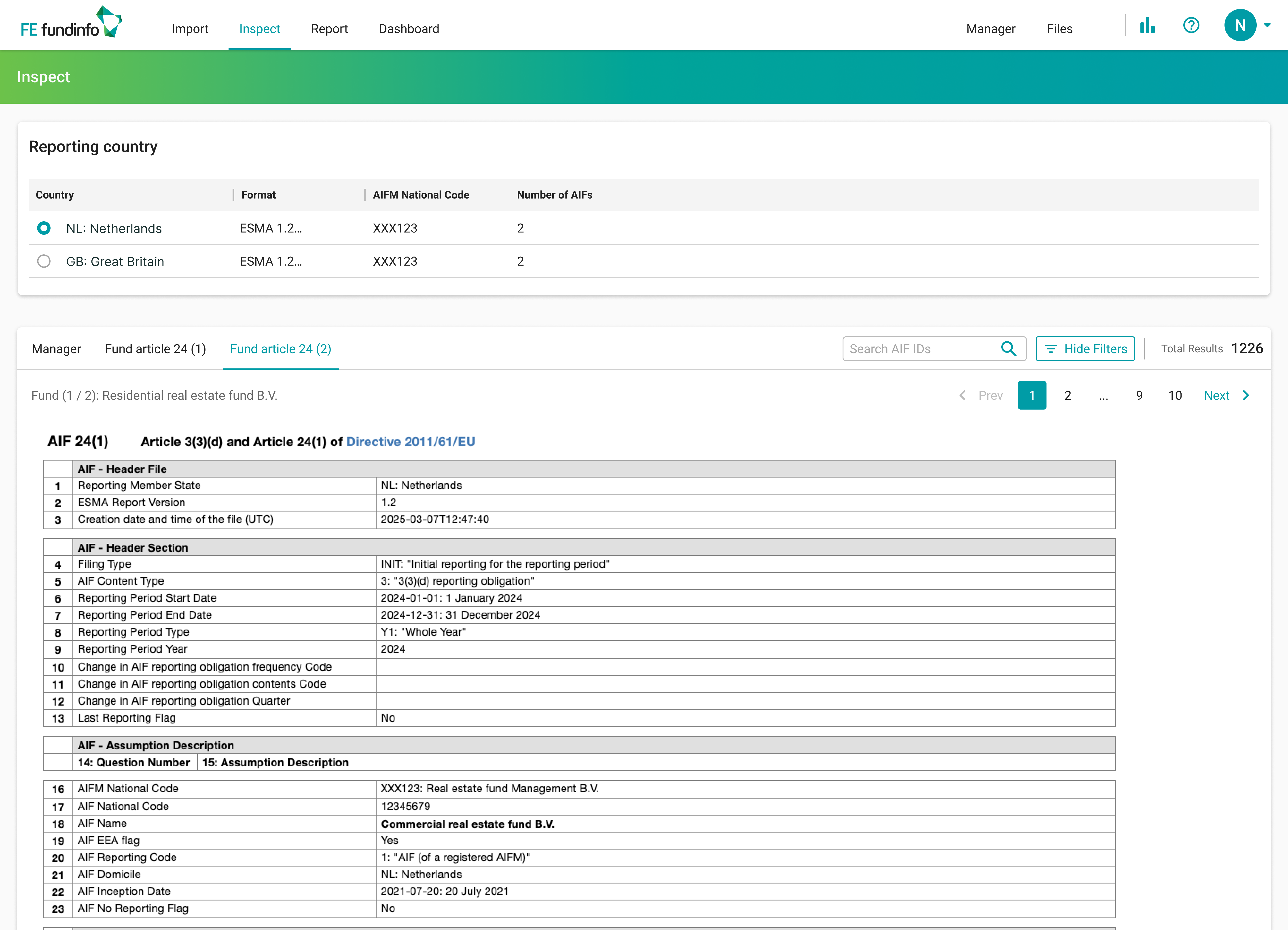
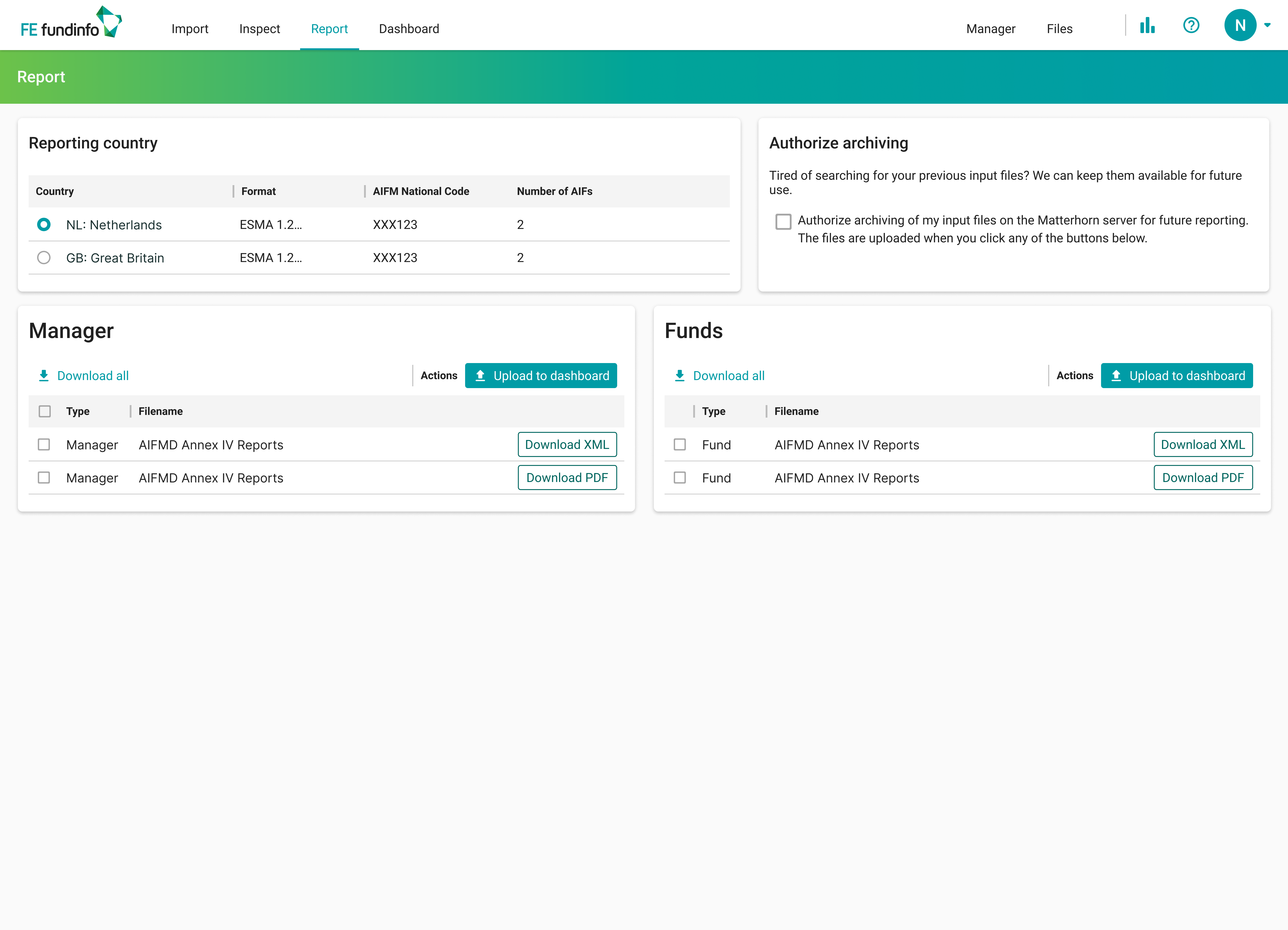
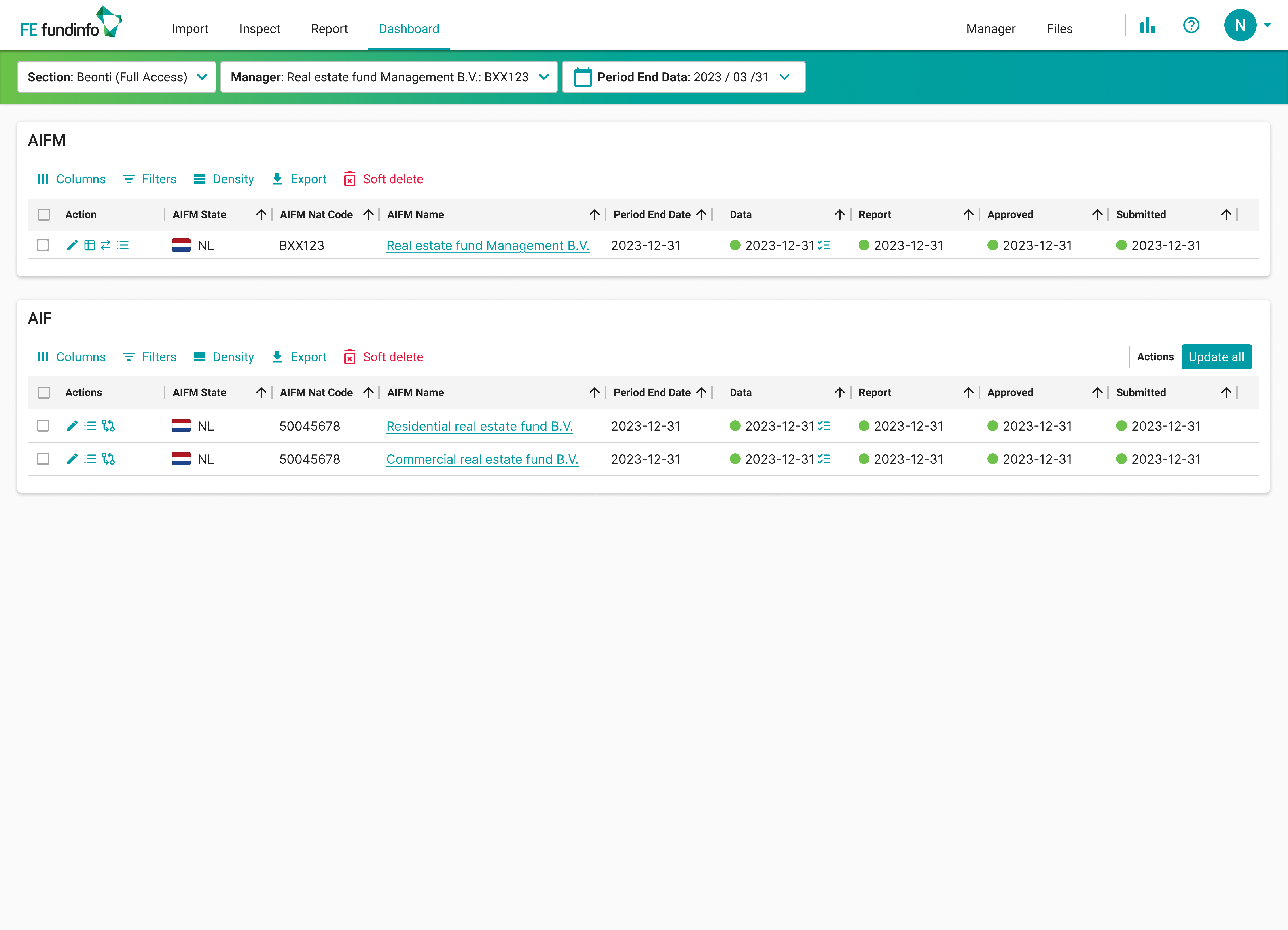
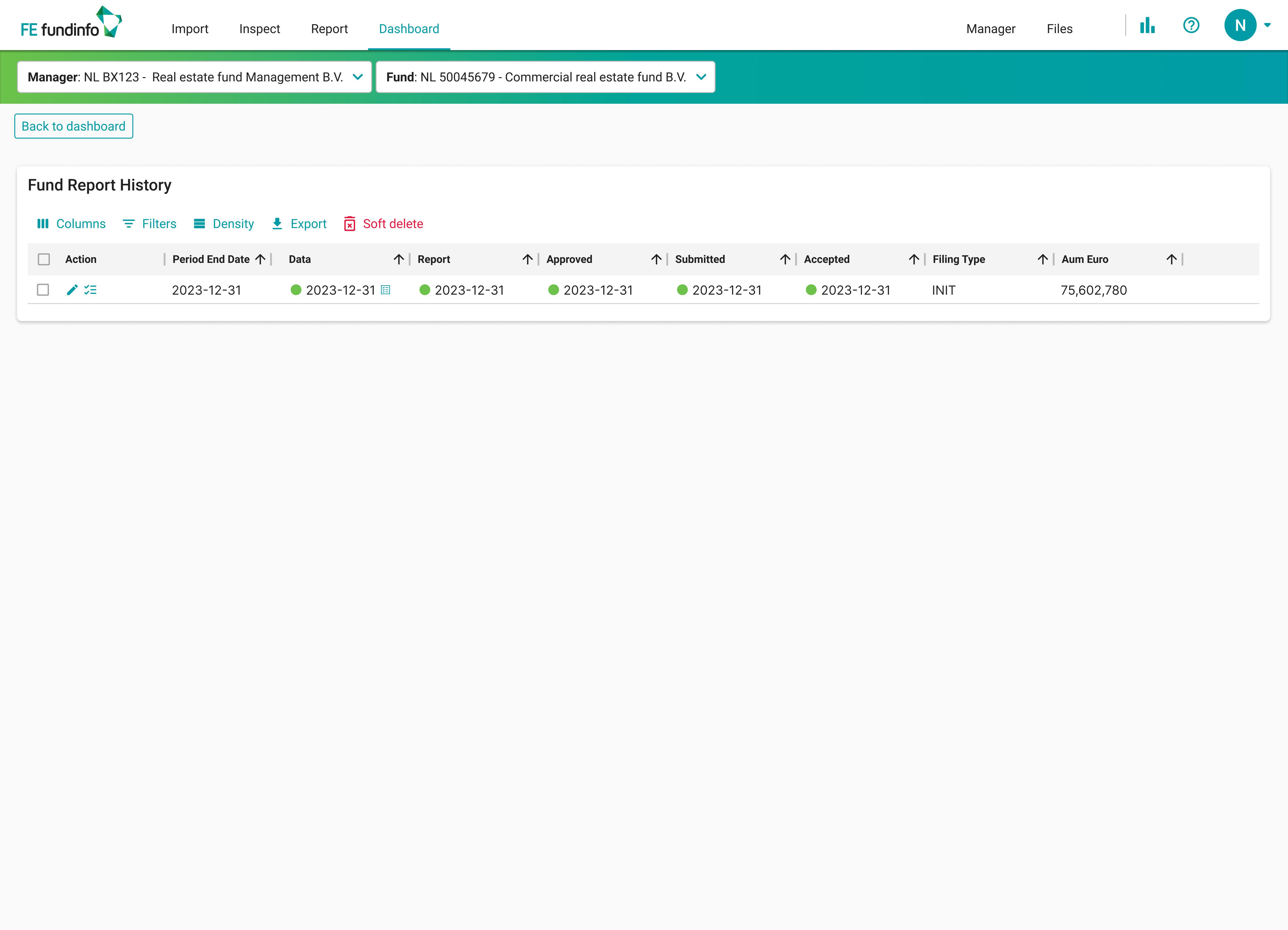
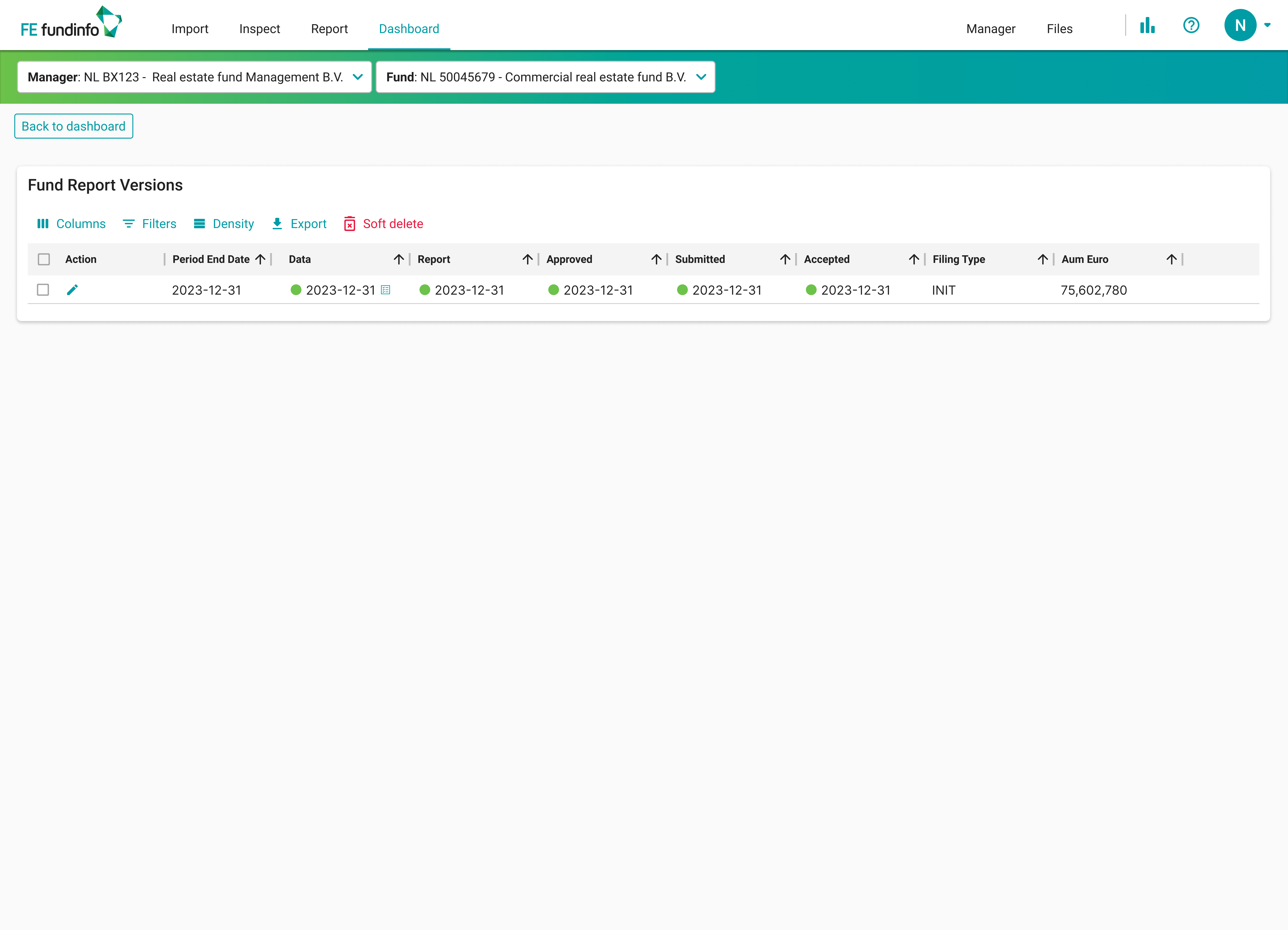
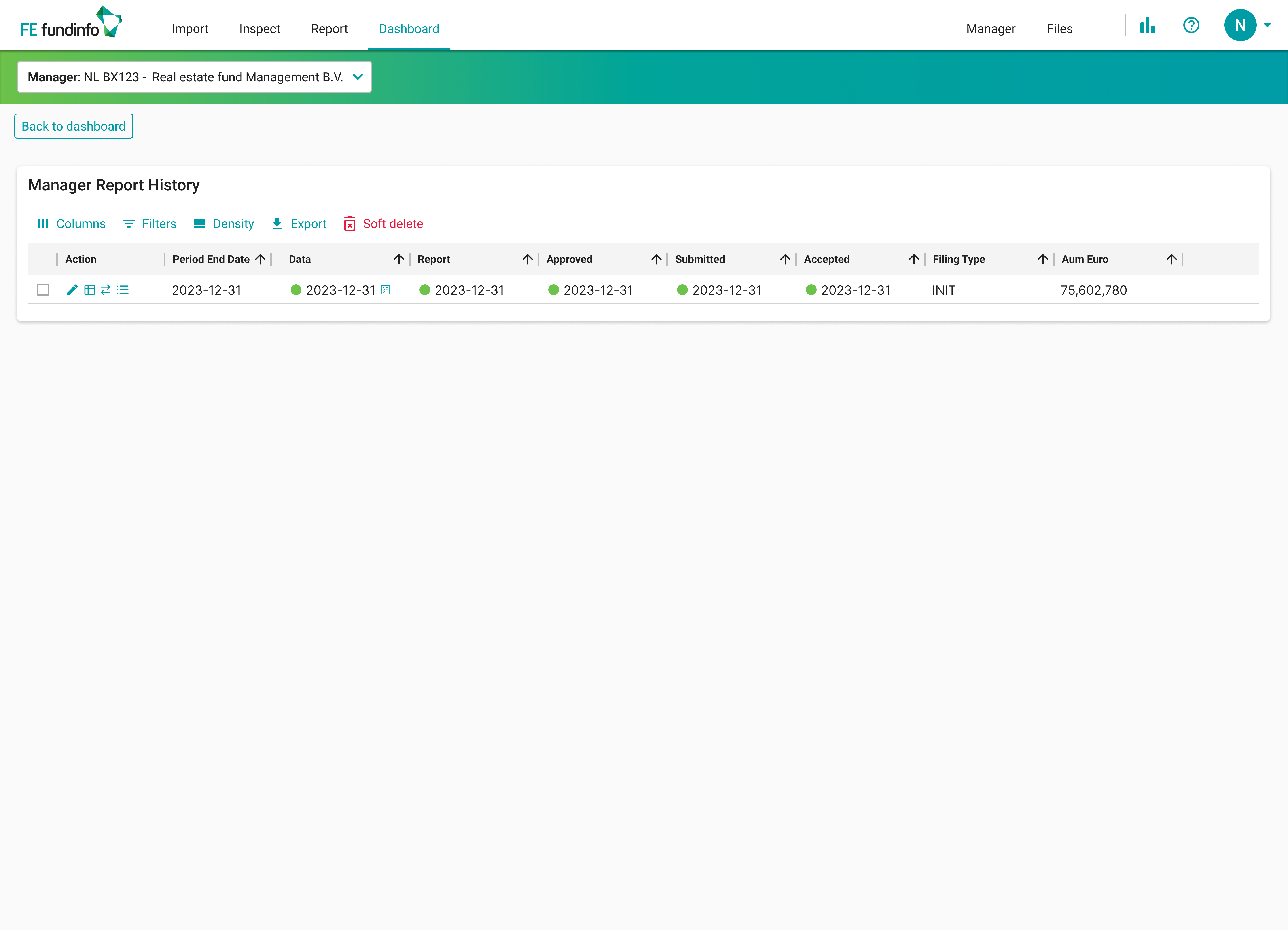
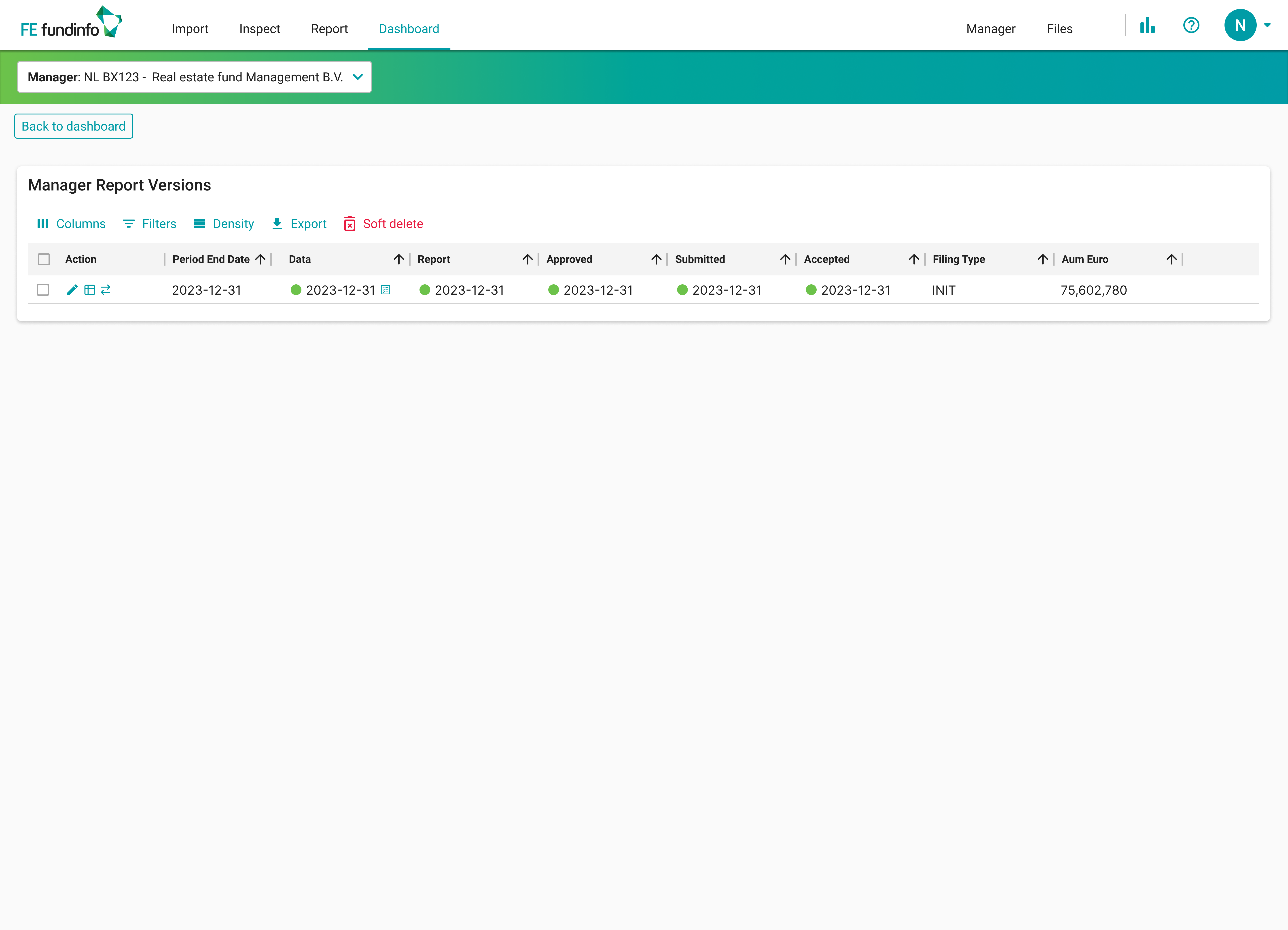
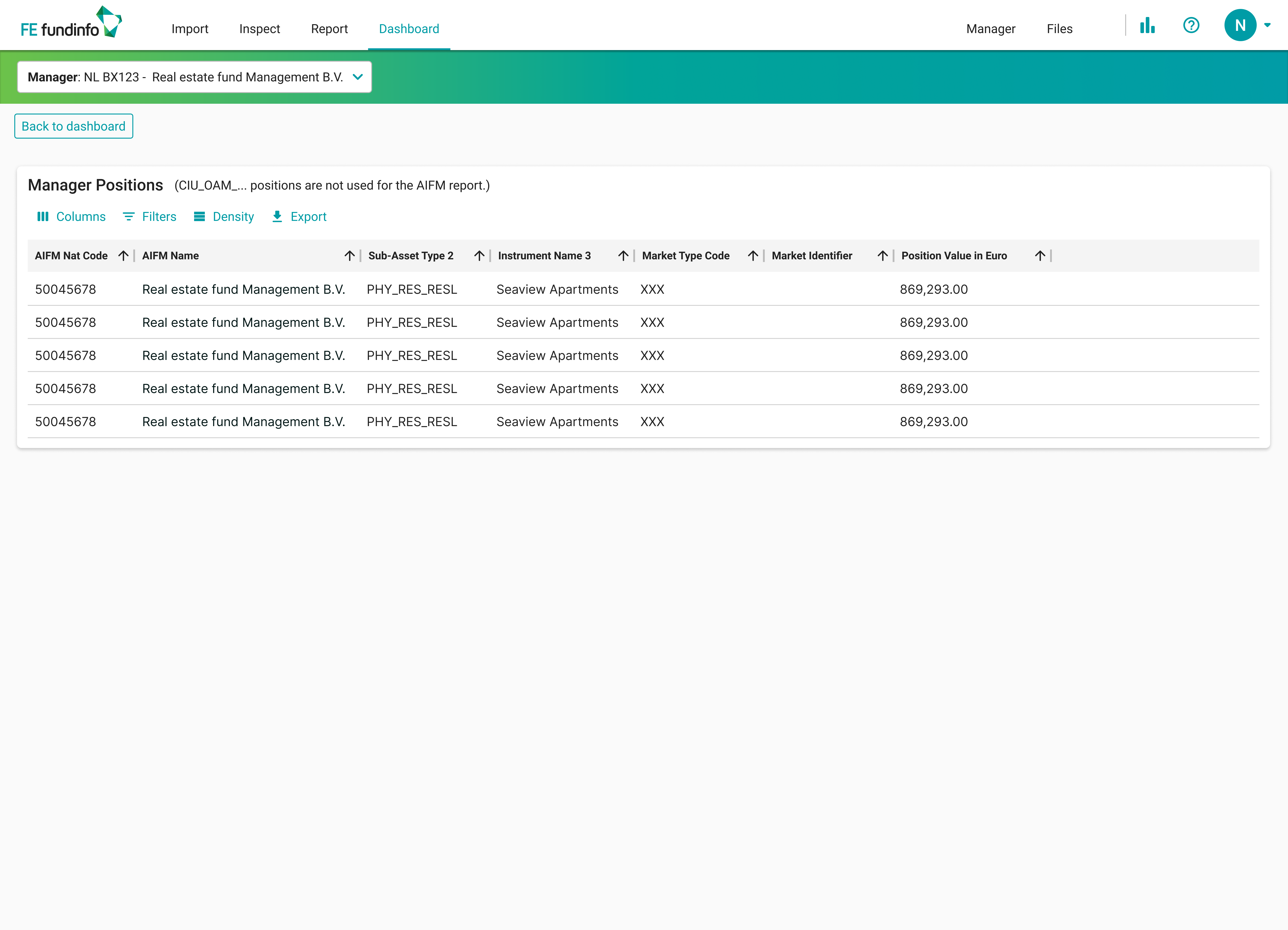
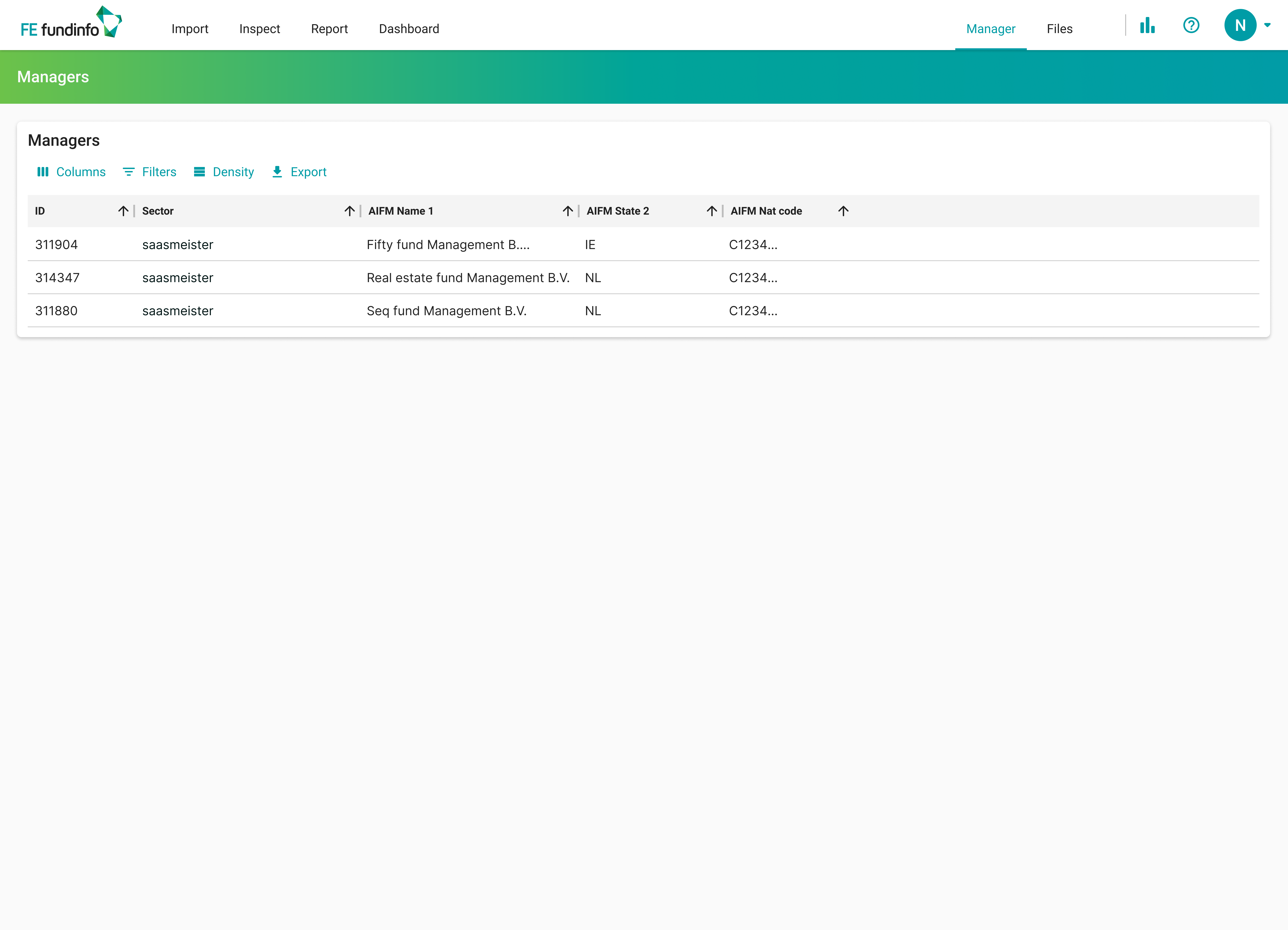
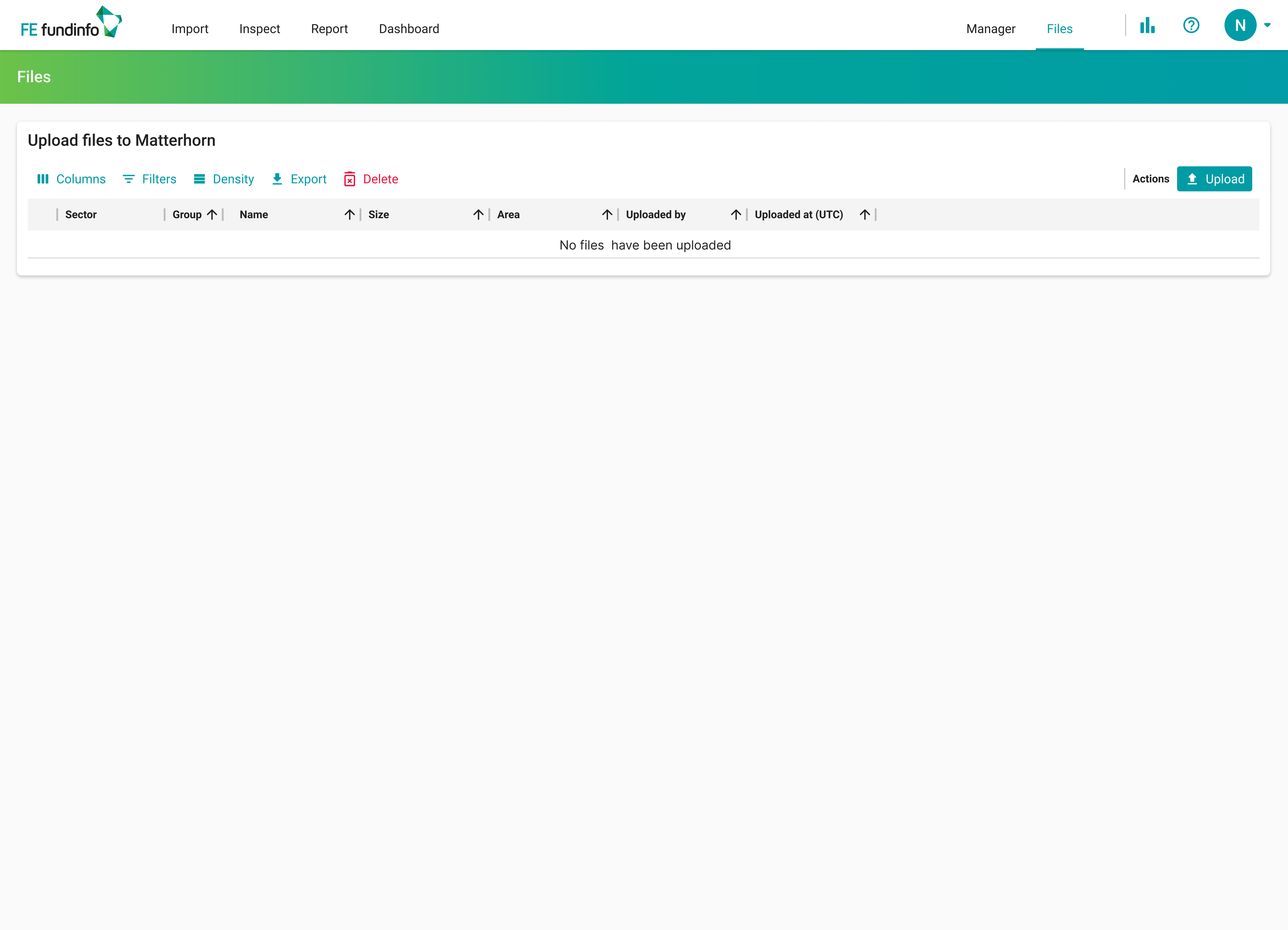
Mid-project, Matterhorn was acquired by FE fundinfo. New owners, new design system, new constraints. The redesigned flow had to survive the shift - and it did. We rebuilt every screen on the FE tokens, kept the flow logic untouched, and the team picked up the new visual surface without losing momentum.
What I'm proud of: the work decoupled cleanly. Flow and visual system live separately enough that an acquisition can rewrite one and not break the other. That's the long-term value of doing the research first and the polish last.
What I'd do differently: bring engineering into the flow conversation in week three, not week thirteen. Some of the cuts I'd proposed turned out to be load-bearing on the backend. We re-routed. We could have re-routed sooner.